
Intro
Theming your Flutter app can be a challenge. This post will try to help you with the following:
- Provide sensible theme defaults for both light-mode and dark-mode.
- Customize the default theme.
- Extend the default theme.
This post comes with a sample app on Github. You might want to check it out because the code snippets in this post will make a lot more sense in the full context of the sample app.
Sample app:
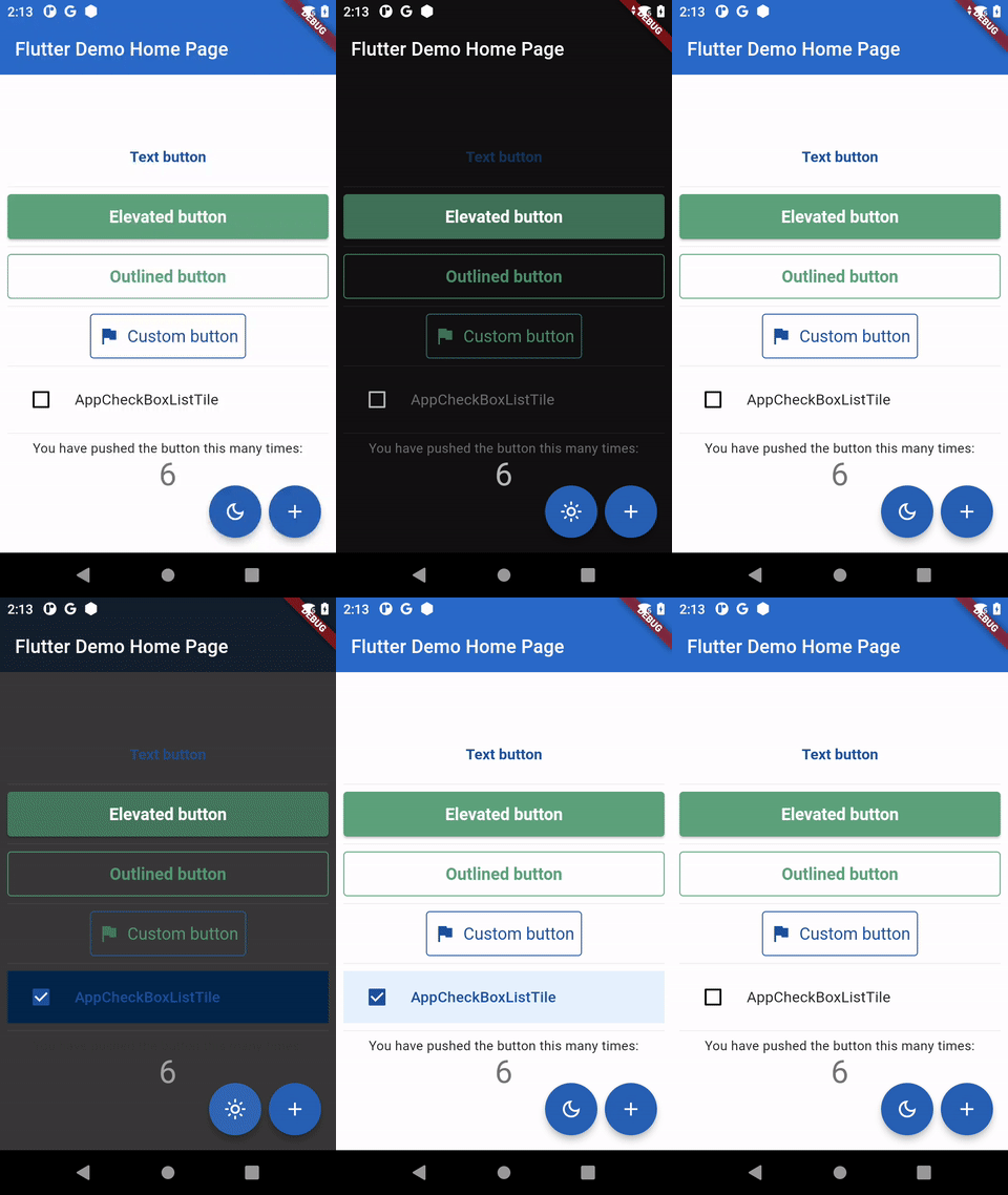
Provide sensible theme defaults
If you want a quick start, I recommend using Mike Rydstrom's FlexColorScheme package.
This truly amazing package will give you sensible defaults for light-mode and dark-mode by providing at least one color.
app_theme.dart
ThemeData get _theme => _flexColorSchemeFactory(
  colors: FlexSchemeColor.from(
    primary: _basePrimaryColor,
    secondary: _baseSecondaryColor,
    error: _baseErrorColor,
  ),
  visualDensity: FlexColorScheme.comfortablePlatformDensity,
).toTheme
With that package initializing the theme in your will be as simple as:
main.dart
MaterialApp(
  title: 'Flutter Demo',
  theme: const AppThemeDataLight().theme,
  darkTheme: const AppThemeDataDark().theme,
   home: const MyHomePage(title: 'Flutter Demo Home Page'),
);
Customize the default theme
If you want to change the default theme, you can use the copyWith method on the ThemeData class. This method allows you to swap some parts of the theme with your own.
app_theme.dart
ThemeData get _theme => _flexColorSchemeFactory(
  colors: FlexSchemeColor.from(
    primary: _basePrimaryColor,
    secondary: _baseSecondaryColor,
    error: _baseErrorColor,
  ),
  visualDensity: FlexColorScheme.comfortablePlatformDensity,
).toTheme.copyWith(
  elevatedButtonTheme: _elevatedButtonThemeData(),
  outlinedButtonTheme: _outlinedButtonThemeData(),
  textButtonTheme: _textButtonThemeData(),
);
Extend the default theme
Sometimes you want to add custom colors and properties to the theme. With an extension method on ThemeData, this worked out pretty simple.
app_theme.dart
extension AppTheme on ThemeData {
  AppThemeData get appTheme => brightness == Brightness.dark
      ? const AppThemeDataDark()
      : const AppThemeDataLight();
}
With this extension method, getting custom colors and properties becomes really easy and intuitive.
'custom_button.dart'
import 'package:flutter/material.dart';
import 'package:flutter_riverpod/flutter_riverpod.dart';
import 'package:yapb_theme/classes/app_theme.dart';

class CustomButton extends ConsumerWidget {
  const CustomButton(
    this.text, {
    Key? key,
    this.onPressed,
  }) : super(key: key);
  final String text;
  final VoidCallback? onPressed;

  @override
  Widget build(context, ref) {
    return OutlinedButton.icon(
      style: OutlinedButton.styleFrom(
        minimumSize: const Size(48, 48),
        padding: const EdgeInsets.all(8),
        side: Theme.of(context).appTheme.customButtonBorderSide,
      ),
      label: Text(
        text,
        style: TextStyle(
          fontWeight: FontWeight.w400,
          color: Theme.of(context).appTheme.customButtonColor,
        ),
      ),
      icon: Icon(
        Icons.flag,
        color: Theme.of(context).appTheme.customButtonColor,
      ),
      onPressed: onPressed,
    );
  }
}
About the sample app
In the sample app I have used the techniques from other posts in this blog. Key elements in this sample app are:
About the author
https://bsky.app/profile/sander-roest.bsky.social
Comments
Join the discussionNo comments yet. Be the first to comment.


